
icon These are the most common settings that apply to all sections or sections with common features. As follows:
icon 1. Main settings: It’s located at the top ( apply for all sections )
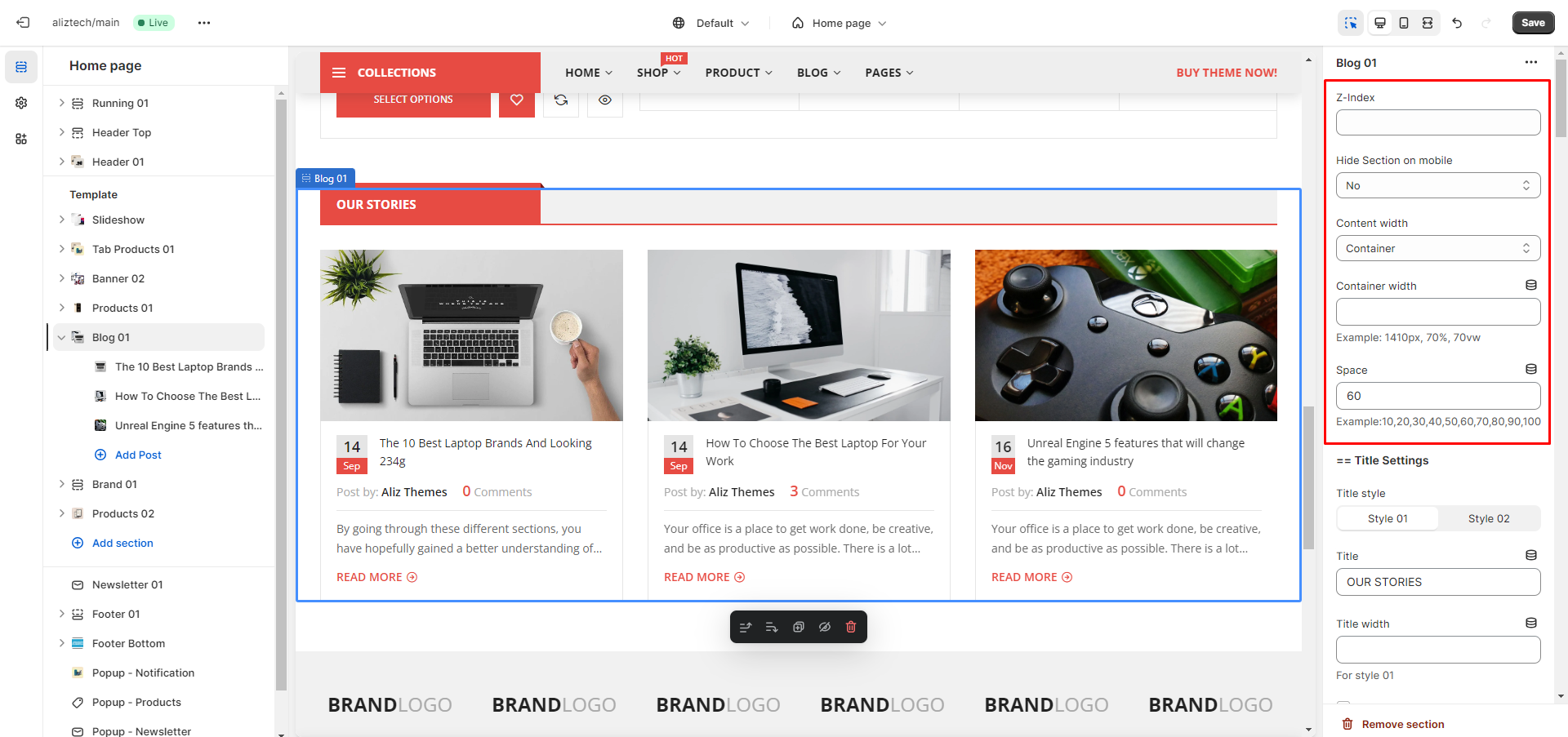
— Z-Index: The higher the index, the higher the display priority. That is, it is possible to insert into other sections, the values are positive integers
— Hide Section on mobile: It can be hidden on mobile or not. There are many screen resolution options to hide the section ( < 1200px, < 992px, < 768px )
— Content width: Determines whether the main content will be inside the container or will be full-width relative to the section
— Container width: This is the width of the main content including the sidebar ( Similar to Theme settings / Container and sidebar that we mentioned in the previous document ). Of course, this option only works when the Content width option above is Container, the value is positive real numbers with many types of units: px, %, vw,…
— Space: This is the distance from the current section to the next section, can be entered or not, the value is one of the following numbers: 10, 20, …, 100 (corresponding to 10px, 20px, …, 100px). If you want to enter other distances besides these specific values, use the Margin option (we will mention it below)
icon 2. Main settings: It’s located at the bottom ( apply for all sections )
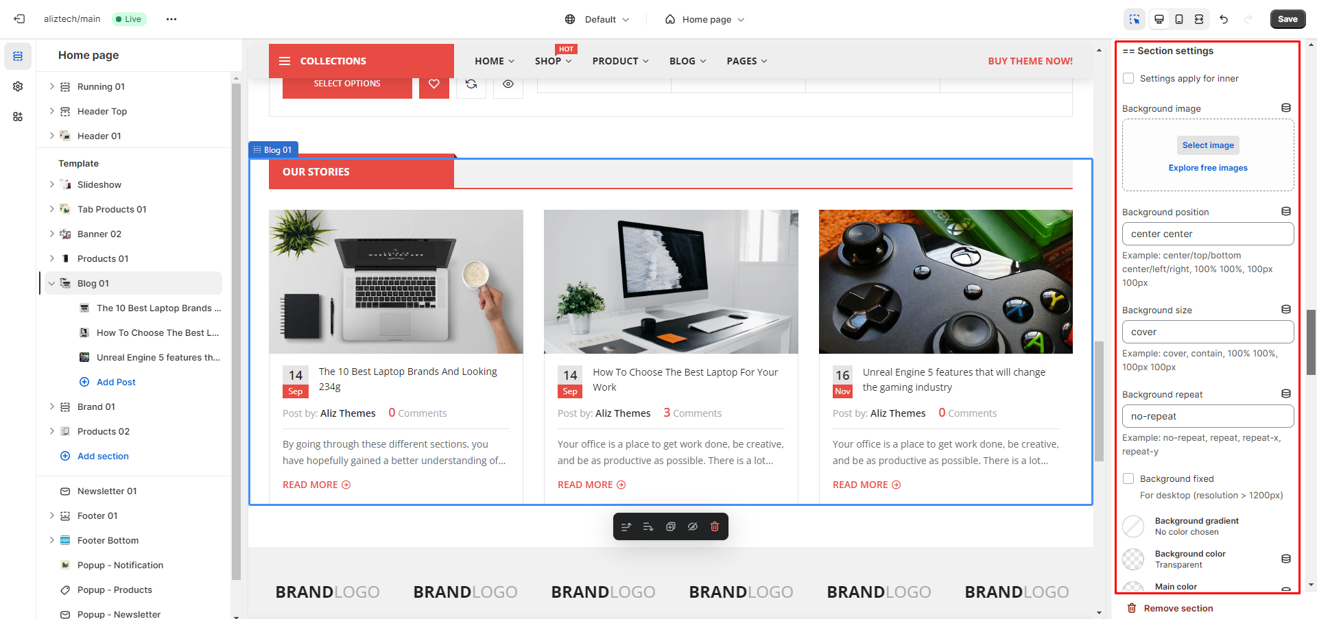
— Settings apply for inner: When not checked (by default), all options below will be applied to the section. When checked, all options below will be applied to the main content of section
— Background, Color, Typography, Border, …: These options are for Appearance
— Margin, Padding: Dertermines the margin, padding for section in 4 directions. Values are real numbers with many types of units: px, %, vw,… Example: if the value is “10px” -> top/bottom/left/right: 10px; if value is “10px 5px” -> top/bottom: 10px, left/right: 5px; if value is “10px 5px 0” -> top: 10px, left/right: 5px, bottom: 0; if value is “10px 5px 0 5px” -> top: 10px, right: 5px; bottom: 0, left: 5px;
icon 3. Title settings ( Apply for the sections that may have the titles such as: Product, Tab product, Collection, Blog, … )

icon 4. Loop settings (Apply for sections that have the list items such as: Product, Tab product, Collection, Blog, Banner, Brand, Iconbox, Imagebox, Store … )
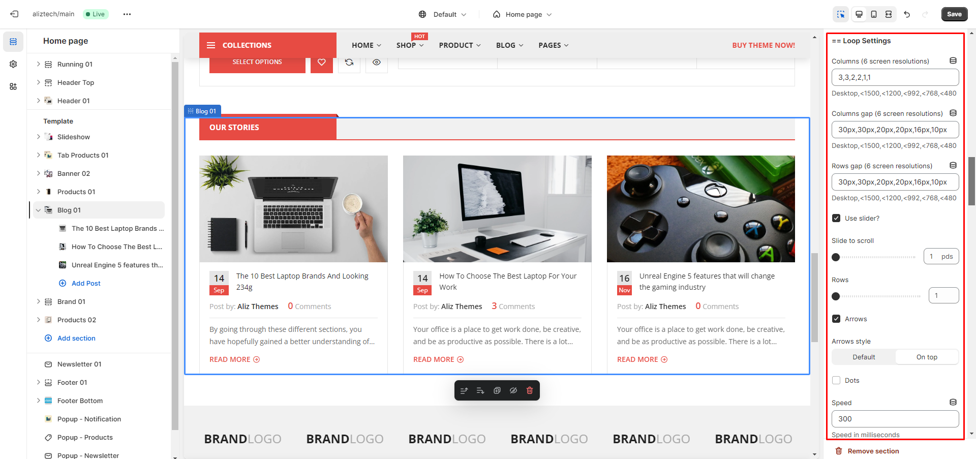
— Columns: Set the number of columns per row, there must be 6 values separated by “,” corresponding to 6 screen resolutions, the values are positive integers.
— Columns gap, Rows gap: Set the distance between columns and rows, there must be 6 values separated by “,” corresponding to 6 screen resolutions, the values are even positive integers with px units.
— Use slider: When not checked (by default), list items will be displayed in grid format, and items will be arranged in order from left to right, top to bottom. When checked, the list item will display as a slider when the number of items in the list item is greater than the number of Columns set above.
— Slide to scroll, Rows, Arrows, Dots, Speed, Autoplay, Autoplay speed, Fade, Center mode, Infinite, …: Some slider settings.


